What is Your Design?
The design that our team ended up choosing is an in-store shopping aide in the form of AR glasses. Our core problem statement is that it is currently very difficult for consumers to compare companies based on their carbon footprint or other ESG (environmental, social, governance) metrics. If an individual wants to purchase a product or make an investment decision, they are not well informed on how each of the companies available to them practice environmental, social, and governmental responsibility. Therefore, our AR glasses solution empower users to utilize readily available statistics, without needing to spend hours of their own time parsing datatables online, to evaluate the items they are buying in real-time and to make optimal purchasing decisions for themselves.
As stated in our feature idea description, our solution needs to include an interface that can be quickly understood by the average consumer that allows them to identify the most sustainable product out of the options available to them in the store. This means that the information that our AR glasses present to the user needs to be streamlined, simple, and essential.
Our interface is composed of three key shopping phases:
| Shopping List, where the user has a set amount of items they wish to buy before entering the store. | 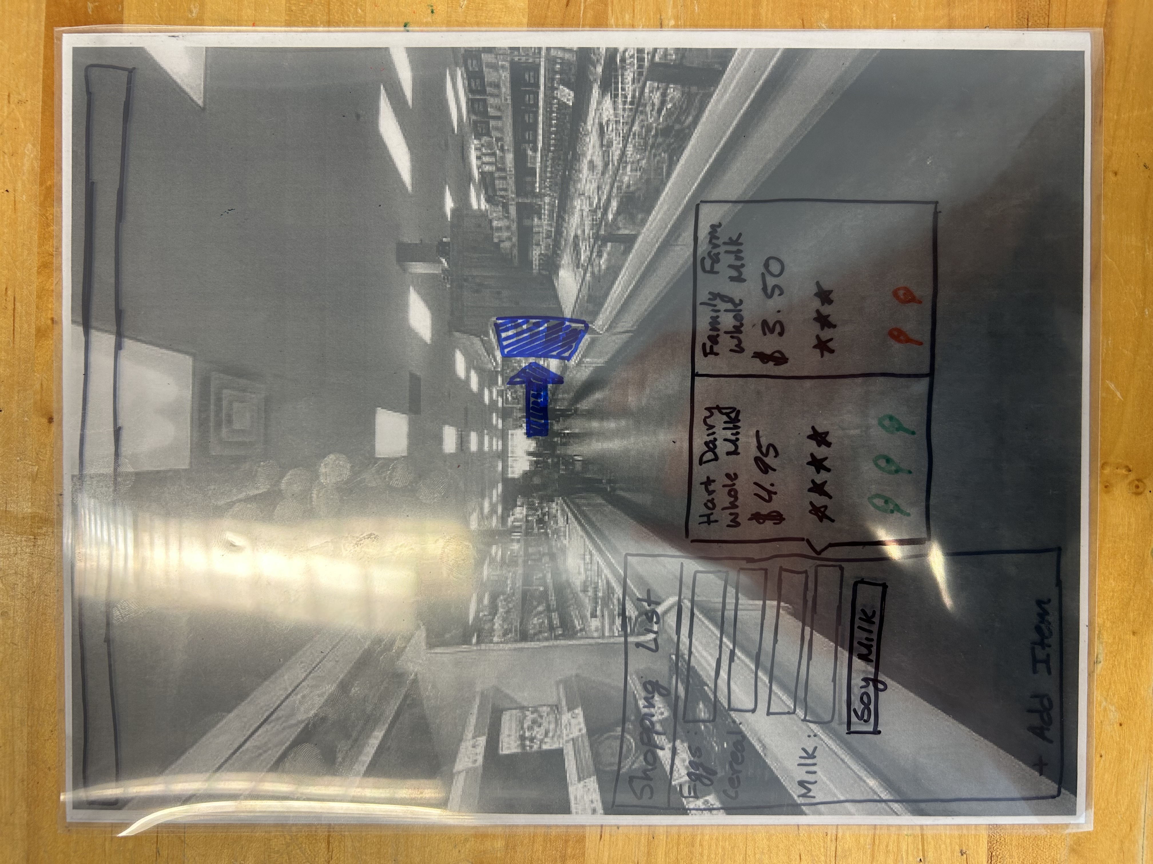 |
| Explore, where the user wishes to browse in the store before making purchasing decisions. | 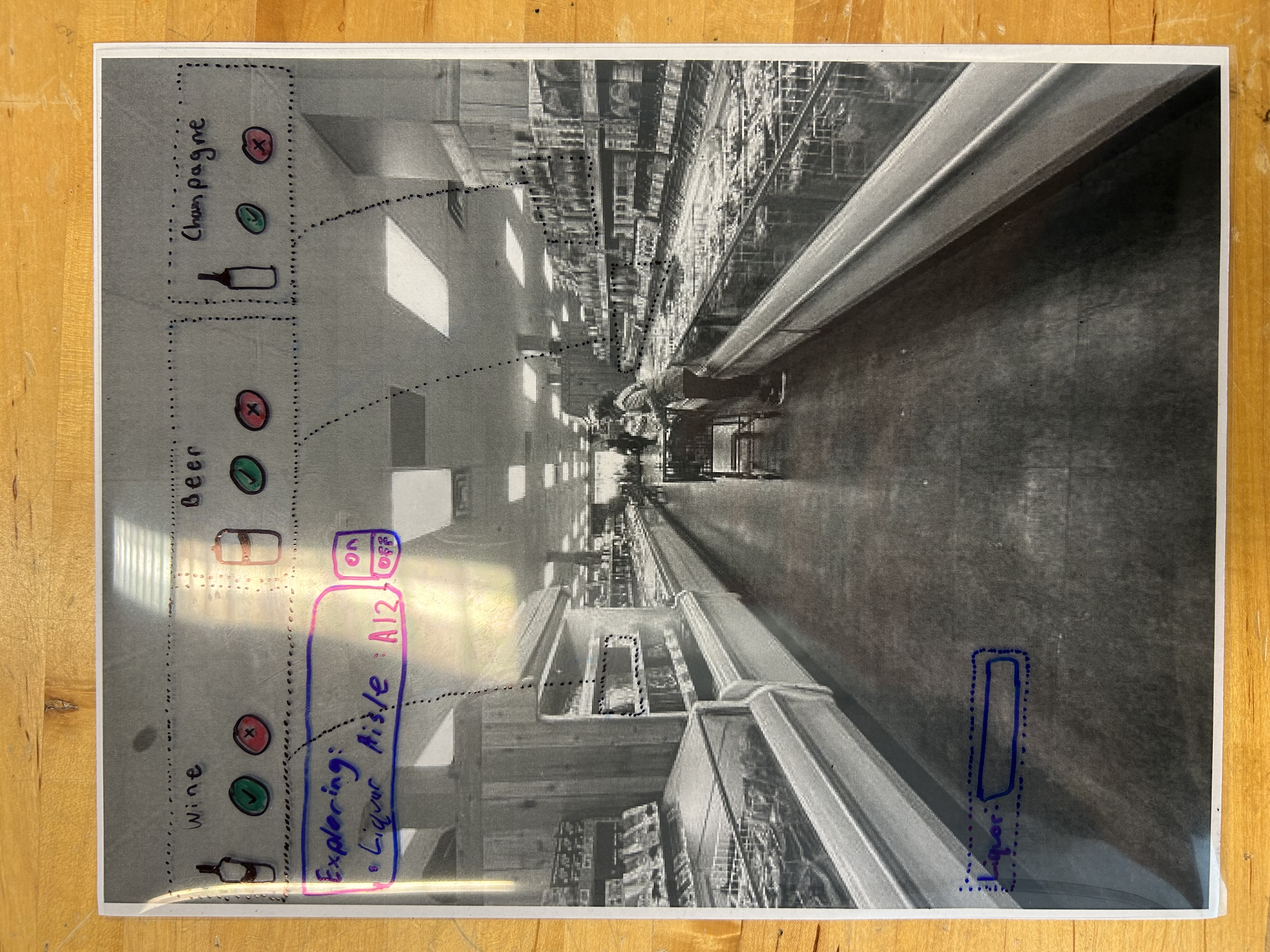 |
| Search, where the user is looking for a certain product in the store. | 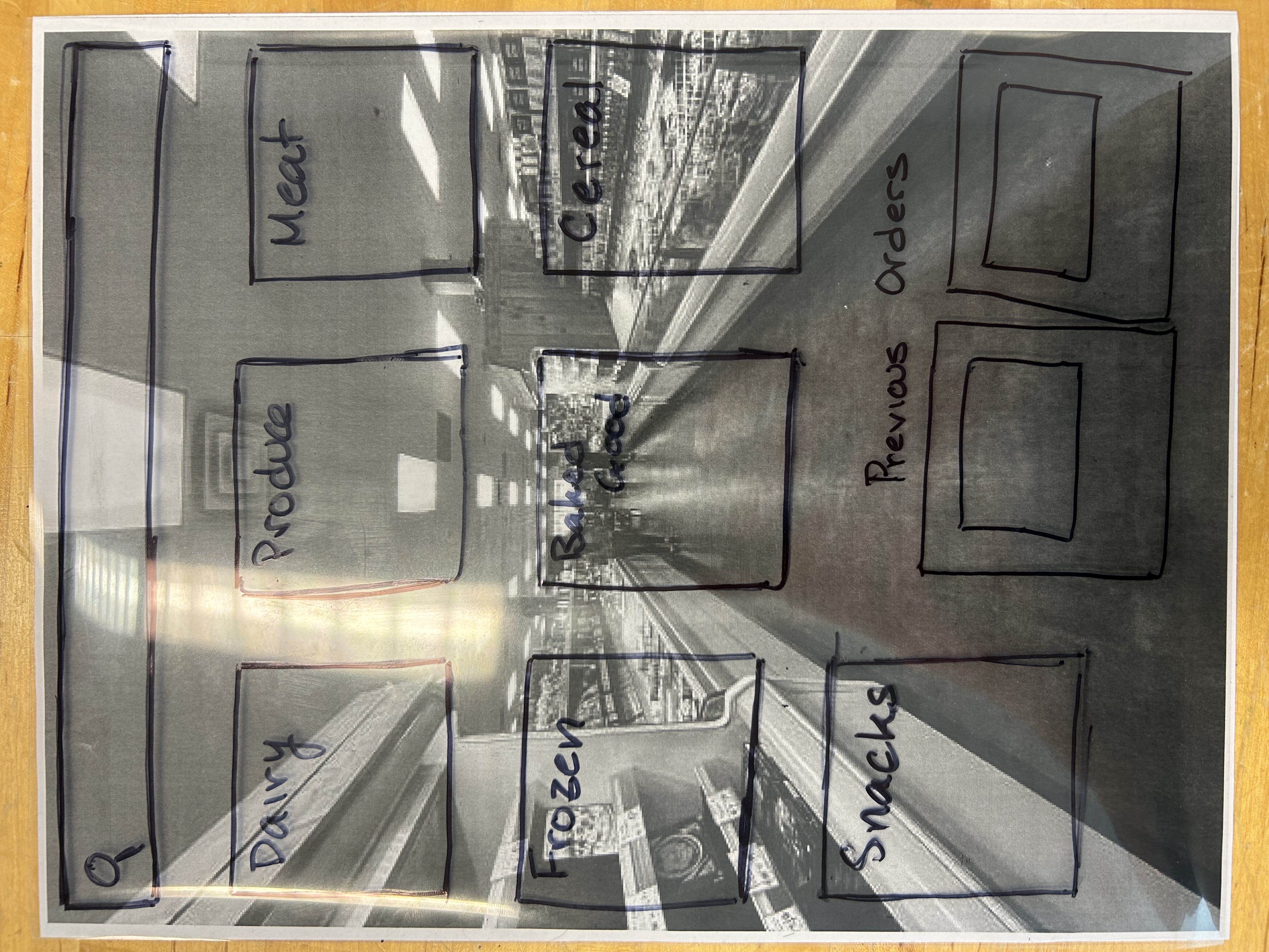 |
In each of these phases, our solution caters information specific to what is most helpful to the user. For the shopping list setting, entering an aisle that contains an item on your list prompts the screen shown in the table that indicates where the item is, and if there are alternatives that are more suitable to your preferences (these are set up during the one-time configuration phase). For the explore phase, items are suggested at the top of the screen, and these get more specific as you get closer to the shelf, or a specific item. Finally, for the search phase, a menu of only the products available in the store are shown to the user, and they are able to search or browse by category.
How Does it Work?
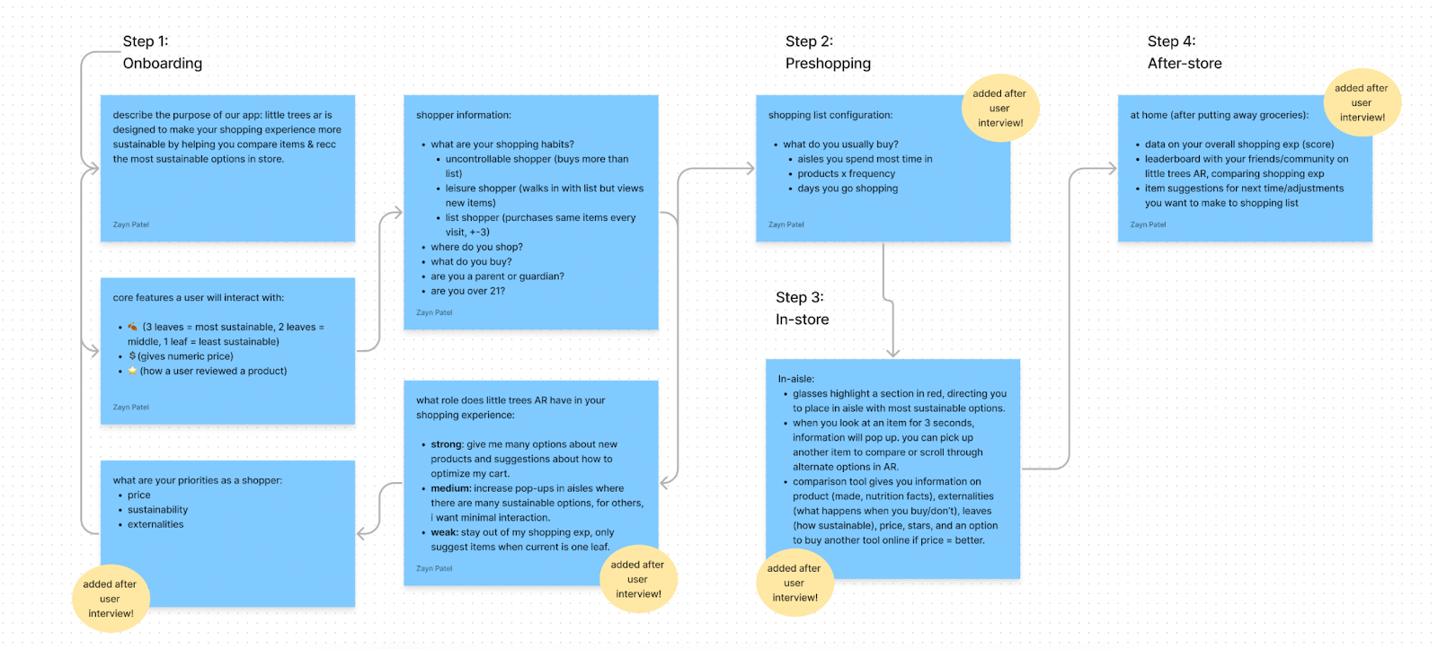
Our AR product works in 4 steps, originally, and 2.5 steps after the user becomes a routine shopper. After users download our product from the Meta AR app store, they will complete five onboarding steps that give us information about them as a shopper. We have questions about what type of shopper they are, how we can help in their shopping experience, what the core features of our app are, and more. Because AR is a new experience for some, the first step of onboarding is to give users an example of what a shopping experience might look like through an at-home simulation where they can get a description of our app, overlaid in their environment, interact with grocery store objects in their home, and see the core features superimposed on those objects. It’s important for users onboard in augmented reality instead of their mobile device. In order to create a database of the shopper’s typical goods and where/how they shop, we want to learn about their habits. We’ve created subpersonas of Techno Todd (our main persona) like an uncontrollable shopper (hint: this is the football fan at costco with 3 packs of tortilla chips). The shopper information helps us know which AR mode to give a shopper. Because the users we have will prefer variation in how they see data and compare products, we want to set up these modes and a user can manually change them after. Information about where a user shops, what stage of life they’re in, typical products on their list help us gather enough information to recommend items a shopper might like. The worst case is when a shopper standing in an aisle inputting onboarding-like information because we know them well enough. Even worse if they have a child who is running around Costco looking for free samples while they’re finding a more sustainable cereal and type out where they’re shopping from. We were very fortunate to have been able to present a basic paper prototype to a local professor teaching sustainable entrepreneurship, who is willing to pay more to live an eco-conscious lifestyle (which lines up with our intended user base); we will refer to this user as Professor, to preserve his anonymity. The modes for shopping that we developed were recommended by Professor. He mentioned that in addition to giving users modes, part of the onboarding should be spent learning about their priorities while shopping. To paraphrase, he mentioned: “Do they care more about price or sustainability or something else? I would pay more for a product if it was more sustainable but that’s a specific fact about me as a shopper.” We added a section for user priorities after Professor’s recommendation.
Another insight we got from the interview with Professor was, to get information on the frequency a user buys products so we know to remind them if they forget. Or, if they buy milk every two weeks, we can notify them at that frequency. This is part of the pre-shopping when a user is giving us information about their typical cart. In addition to the product names (ex: chicken), they can open a dropdown menu and tell us how often they buy the product (ex: once a month). Shoppers can indicate if they’re seasonal too.
While a user is in store, sections of the aisle will be highlighted for them, giving them information about where to find an item. As they approach and view the item we recommended for them, more information will appear at a set time interval (ex: every five seconds, more statistics and products will appear). This was a recommendation by our user to prevent user overwhelm. Users can compare products that are next to each other, and we will give them information about the price, user reviews, sustainability score, externalities of buying the product, if there is a product available at another store that’s more sustainable, etc.
After they’ve completed their shopping experience and have arrived home, we will spend five minutes with a user to wrap up their shopping experience. This includes an overall score of how they shopped, generated by weighting the leaves of the products they bought and dividing by the total number of products. Our user mentioned that mild gamification between users could encourage more sustainable shopping behavior, we’ve acknowledged this too and added it as a feature.
Steps 2, 3, 4 will be repeated every time a user shops with us.
Our Lo-Fi Prototype Photos Showing how the Experience WorksHow Well Does it Meet User Needs? In What Ways Does it Fall Short?
Our design seeks to make the shopper’s experience pleasant while shopping as well as help them make sustainable choices regarding the things, food or otherwise, they consume. We have tried our best to establish what consumers would like their experience to look like while interacting with our design and a few things came out.
The first thing we realized is that users would not want the experience to feel like a hard responsibility. This is because the shopping experience is currently tiresome and so they would not derive any value if the solution we are offering felt the same way or even worse. As a team, we decided to consider the feedback that we received from the person we interviewed and come up with a more relevant experience for users. As a result, we have ensured that the user interaction with the iteration of our first design is brief and faster to get through. For instance, we have eliminated a lot of product description in the form of words and adopted symbols to represent some aspects of products during shopping.
Furthermore, as a team, we have ensured that the design is user friendly to eliminate any frustrations that might come with a complicated design for users. To do this, we have decided to give the user some control over the platform we envision, by configuring what they would love to see on the platform during the onboarding stage. For instance, although some users like to shop sustainable products, they are also price conscious and they would love to see that information on the product description. Some users may love suggestions of other alternatives while others may not. Consequently, we decided to give users the choice to decide what information they want to see on the platform.
Generally, the design ensures that users(shoppers) save as much time and resources–if they want to–as possible. For instance, in the design, we give directions to where a product is located on the store aisles, and while there, the platform will offer other alternatives to the product that the user has chosen. This allows users to save time that they would have used to wander around/windowshop. Additionally, if the user wishes, other similar products could be suggested that are cheaper and sustainable for the user to choose from. This option allows some users to save money while still being a sustainable consumer.
However, there are some tradeoffs to our design. For instance, for those users who heavily rely on social influence to purchase items, our design might not meet that need fully. The design has some aspects of this, whereby reviews are provided but we are still figuring out ways of giving information regarding how other like minded people are spending and the kind of products they are buying.
Finally, if a user is not very tech savvy, they will have a hard time comprehending what is going on at first but the experience is guaranteed to get easier the more such a user interacts with the design. This is partly because the AI will learn about their interests over time, thus streamlining their experience but also because it is user friendly and it should not take them a long time to learn how to interact with it.
What important alternative designs did you consider, either initially or during the refinement of this idea? Why did you reject them/prefer the one you chose?
There were primarily three design alternatives that we were trying to decide between. They were: an in-store cart interface that allowed users to make smarter sustainability decisions, an AR glasses sustainability shopping experience, and a website that allowed users to more easily find information they needed regarding the sustainability of companies. To see preliminary ideation and prototyping, see the protoype photos linked above.
We went through our options and, as a team, decided to go with the AR glasses experience for a few reasons. It was better than the website because it provided more guidance and seemed more adaptive to the future. It was also better than the cart interface because it provided users with more privacy of their selections during their shopping experience; it was also much more immersive and would provide better guidance. Note that we had to accept a few assumptions so that our selection would be fitting. The first is that AR glasses would be the norm; this takes place in a future world where people use AR glasses like they use smartphones. Additionally, we created some personas of people we think would be our ideal customers, and tailored our experiences towards them.
What key insights did you gain in trying to produce a design that addressed your brief?
During our design process, we encountered numerous insights that have informed our journey and subsequent design iterations.
One of our biggest insights came from integrating real users in our design process. We realized the importance of in-person interviews and usability testing with a paper prototype while designing. During this test, we took on roles including the “computer” and “flight attendant” to simulate an in-person test of our design and observe Professor’s interactions. From this experience, one major observation we made was that Professor was often overwhelmed with the long lists of cereal choices or the flashy, moving direction arrows.
Another major insight was realizing that our knowledge/experience impacted the way we used the design, differently than how a user would. Because we (Little Trees) worked with the prototypes and developed the designs from scratch, many of us were familiar with the interface, and had a clear understanding of what all the menus, comparisons, and signs were meant to do. However, a user who had never seen our product, nor had they seen the development, provided us a pair of fresh eyes, and a better representation of the user we were designing for. At the end of the day, we weren’t designing a solution for the Little Trees team, we were designing for an audience of users who had never seen the design process, and still needed an intuitive experience.
A third insight was the value of low fidelity prototyping, as a tool to turn high-level ideas into tangible interfaces. Even though our prototype was made of hand-drawn, expo-marker sheets, and not the sleek, augmented reality interface we might want to see in the future, we could identify pain points, functionality, and evaluate design choices at a more fundamental level. Sure, we as Little Trees could try our best to predict how our users might interact with our product, but this exercise shined light on design challenges (or even things we did well!) that we would not have otherwise seen.
For example, we observed the Professor attempting to “swipe” away different menus hoping they would disappear. Features such as the dashboard, the clock, or time, were cluttering up the space, and his behavior informed our future prototypes, which heavily cut down on the clutter, and emphasized individual choice (eg, if they wanted to see a feature or not, they could easily turn it on or off).
How is this different from conducting direct needs-analysis interviews? Instead of directly asking consumers “hey, what do you think of this,” our interactive usability testing allowed us to see what users did in real time. We could see where they used the interface with ease, where they hesitated, and where they struggled and needed help. Users do not always tell us everything, so this style of testing allows us to collect feedback from their natural behavior.
Phase Effort Distribution
| Task | Team Member(s) |
|---|---|
| Ideation, Sketching, Prototyping | All |
| Question 1 Writeup | Alex |
| Question 2 Writeup | Zayn |
| Question 3 Writeup | Lydia |
| Question 4 Writeup | Yehya |
| Question 5 Writeup | Will |
| Website Setup | Alex |