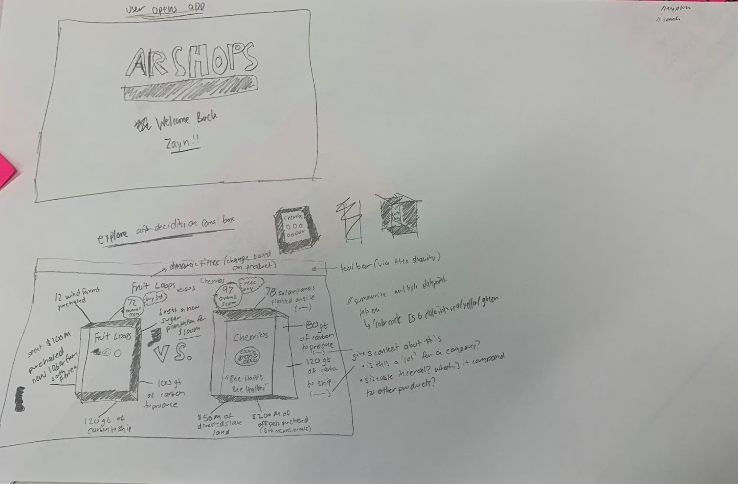
The design idea that we chose to move forward with is AR glasses that display ESG sustainability metrics as the user moves through a store. Our chosen solution touches on the needs of each of our user personas (Techno Todd and Activist Amy). Techno Todd comes from an educated and well-off background, so he is able to afford the new AR technology and gets comfortable interacting with it fairly quickly; he enjoys that purchasing decisions are made simple with the real-time comparison feature of the glasses. Activist Amy is pleased by the widespread access to reliable data and appreciates that it is easy to parse for the average person who is unfamiliar with climate science.
We chose to make our representations using paper and pencil because it is the easiest to mark up and make edits to during a user interview. We used the sketches to represent the user’s field of vision when they look through the AR glasses; this way, it is really easy to image the user’s point of view, and there is no need to prototype the physical glasses. A limitation of this method is that it is difficult to simulate how the user interacts with the virtual display that is superimposed on their reality; however, we can still get effective feedback on our data representations and interface layout.
Furthermore, our group enjoyed the ease-of-erase that sketching using a pencil provided. It was simple to make quick edits that normally we would use a platform like Figma for. We used printer paper to fit the aspect ratio of a MacBook Air laptop, originally, but are going to switch to a paper mechanism that works better with the field of vision an AR user would have access to.
Design Representations
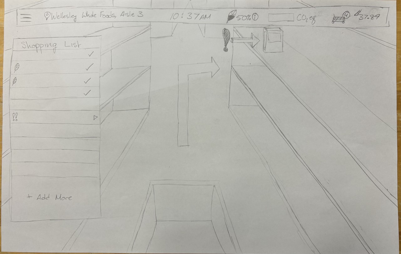
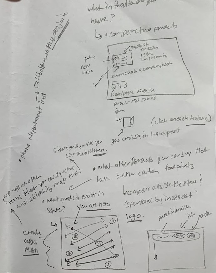
Below is an example of the augmented reality interface a user would see when they’re in the store. One of the user needs we defined was the ability to view comparisons of food items before a user makes a purchase. In the center of this screen, users can see data along with an overall score to make a buying decision. Another user need was to understand externalities. Although a user might enjoy being sustainable, the buying choices users make can have unintended consequences. By definition, sustainable users want a holistic overview of how their decision affects the environment. We included a box with ranked externalities at the bottom of the page.
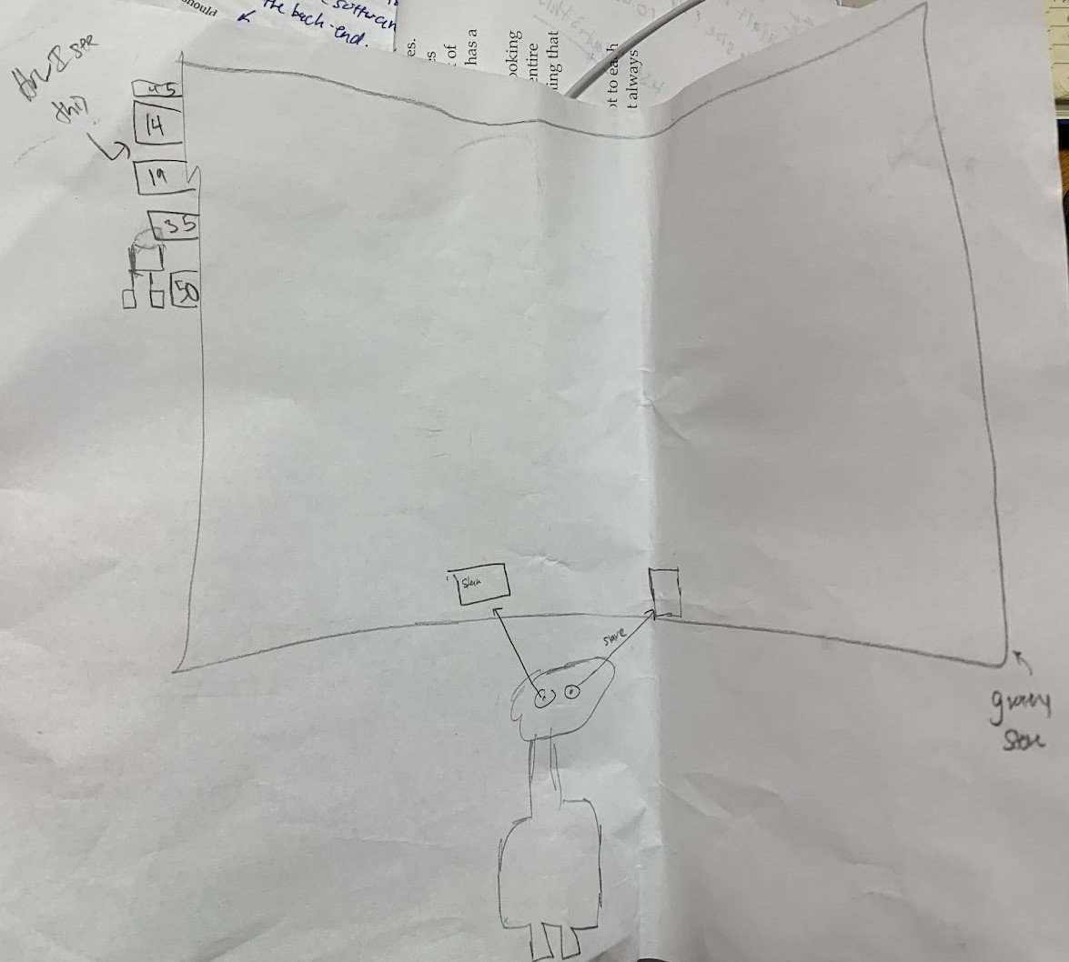
Below is an example of the original sketch showing features based on the user's needs. Maps to guide shoppers to their next sustainable item, an agent to help a user if they’re stuck making a decision, an option to order a more sustainable item from Instacart are three additional features that respond to the user’s core need of being able to make decisions on what’s most sustainable. For example, if an item in the store doesn’t meet their criteria, they can use Instacart’s platform to online order a sustainable item. Because of the scope physical retail stores have, we want to provide instant selection to them online.
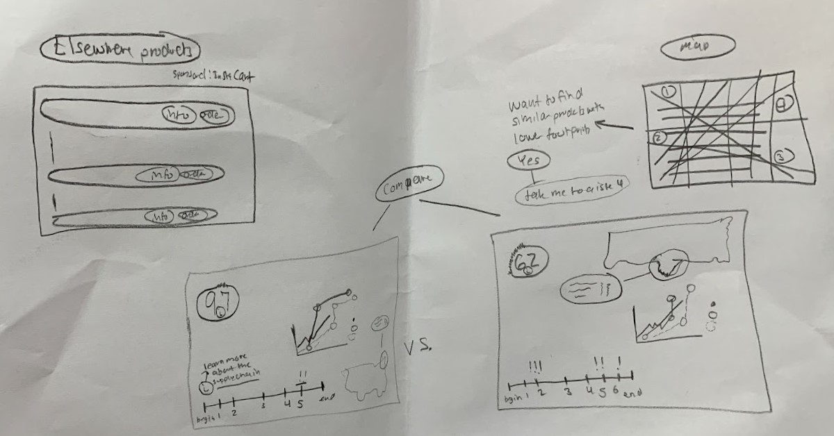
The final screen represents the eye tracking a user can engage in when they want to compare two products. One of our user needs was to simplify the experience of a user because they’re using a new interface (Augmented Reality). We’ve considered having a voice assistant too. We're meeting with a user this Friday and will ask about their willingness to use a siri-like voice when they’re buying a product.