The problem that our team is focused on addressing, as stated in our Needs Analysis document, is that “it is currently very difficult for consumers to compare companies based on their carbon footprint or other ESG (environmental, social, governance) metrics. If an individual wants to purchase a product or make an investment decision, they are not well informed on how each of the companies available to them practice environmental, social, and governmental responsibility.” Therefore, at its core, our solution needs to include an interface that can be quickly understood by the average consumer that empowers them to identify the most sustainable product out of the options available to them in the store in real-time. From our interviews, we learned that consumers don’t want to be overwhelmed with information, so we need to present only essential information in a sleek format.
In our proposed AR glasses solution, this core feature presents itself in several different ways, depending on the shopping preferences or habits of the user. We have divided our in-store shopping experience into three journeys,
- Shopping List, where the user has a set amount of items they wish to buy before entering the store
- Explore, where the user wishes to browse in the store before making purchasing decisions
- Search, where the user is looking for a certain product in the store,
and the user may switch between these options during their shopping trip.
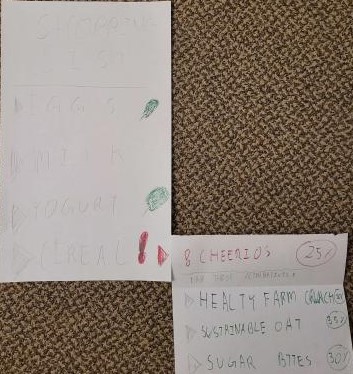
In the Shopping List experience, the comparison feature is less explicit because the user came to the store with specific items in mind; however, our interface flags products that are non-sustainable and gives the user the option to change their selection, if they wish.
The common denominator between the three options is the suggestion engine we will use. Whatever method the user is shopping with, our suggestions prioritize the incorporation of sustainability, balanced by personal preferences of price and quality.

In the image above, the shopping list flagged the user’s chosen cereal option as non-sustainable with a red exclamation point with a drop-down arrow offering sustainable alternatives (indicated by the green color & higher score)
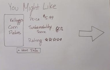
In the Explore experience, the comparison feature is present in a couple of ways. As the user walks through the store, the software will suggest products that the user might want to buy based on preference settings or past purchasing habits, as shown in the image below.

If the user decides to take a closer look at this item, or the other cereal items in the aisle, for example, the software will allow the user to compare statistics of all of the available options.
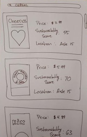
Finally, the Search experience allows the user to search for a particular type of product and do a comparison of all of the options available in the store, as shown below. This allows users to easily compare Price and Sustainability, and where to find the product if interested.
