Heuristic Evaluation Response
Heuristic Violations of Level 3 or Higher
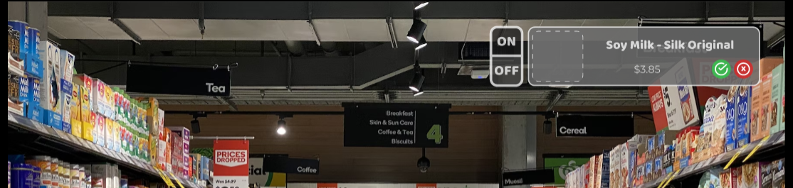
H8 - Aesthetic and visual hierarchy - Severity 3 - 3 (🤟) people found this Problem A: Buttons and elements are grey, a color widely known to indicate an inactive/disabled state in design, hard to tell when one is toggled/pressed Solution A: differentiate when something is active vs inactive, finding another way to present notifications without having them blend into background
We chose not to fully address this heuristic issue because we felt that there were more severe functionality issues that impeded the use of our prototype that we should prioritize; therefore, the button and element colors are still gray in our more refined prototype. However, we worked to address the second point brought up in this heuristic violation regarding it being difficult to identify the state of toggles. The way we chose to address this violation was to increase opacity differences between active and inactive toggle states so that it is easier for the user to see the contrast between the toggle states. To be more consistent with other designs, the active state is the darker opacity, and the inactive state appears lighter.
Problem B: Shopping Cart and Toggle On/Off same through a visual hierarchy perspective Solution B: Highlight whichever is more important/is the preferred action
We chose not to move the location of the shopping list in response to the visual hierarchy feedback. While we received a critique that the shopping list should appear higher up on the screen (perhaps in the upper right corner to be more consistent with e-commerce sites), we also had to consider how the menu is superimposed on the user's reality when they are moving through a store. Having the shopping list appear in the top corner of the screen in Figma likely means that the user will have to physically lift their head to see the items in their list. Keeping the shopping list closer to the user's eye level makes it more accessible in AR.
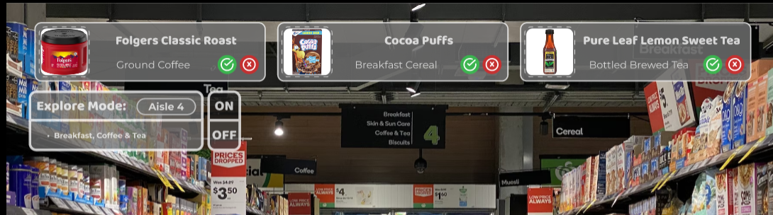
H4: Consistency and Standards – Severity: 3 – 4 (🖖) people found this Problem A: Menus and icons appearing at different locations Solution A: Keep the explore pop up in the same place
We chose not to address this specific issue as there were larger functionality issues that we wanted to prioritize. In two different paths, the explore pop-ups appeared on different sides of the scree. in the explore flow 3 suggestions would come from the top, while in the shopping list flow, one suggestion would come from the right side. Because the menus had the same aesthetics and design language, this wasn’t a major point of friction and didn’t cause a major loss in continuity. Because fixing this would have impacted almost all of the screens, we decided not to address this.
Problem B: No clear indication where you are within the Search flow Solution B: Having a back/forward/exit button for the search flow
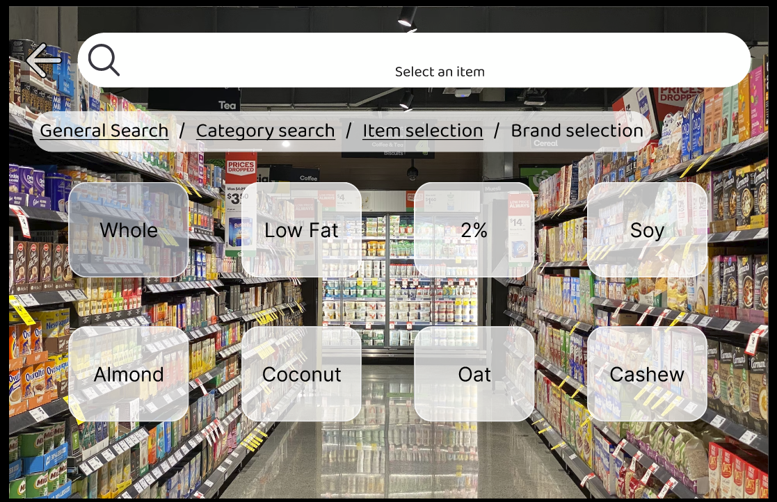
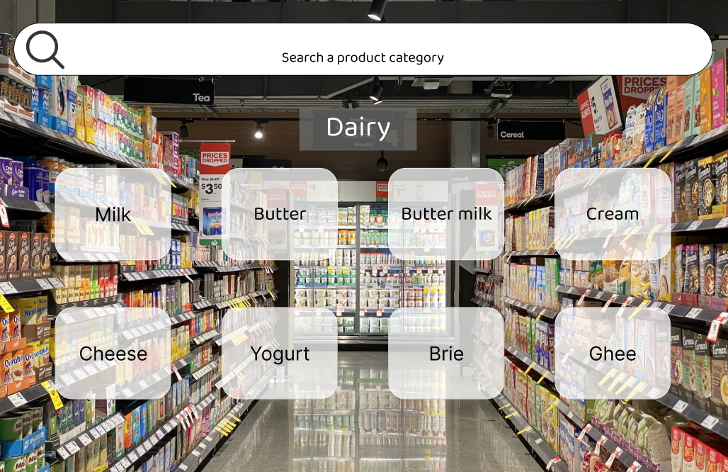
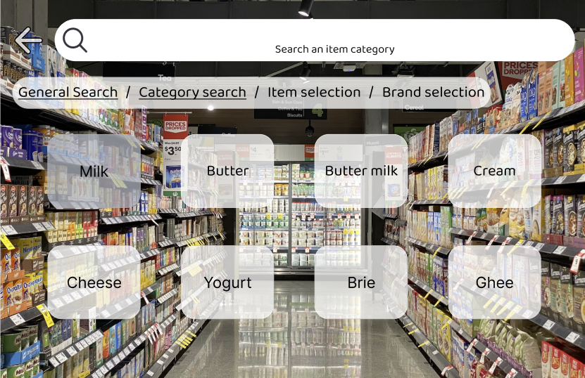
Another heuristic issue was on the search flow, where users mentioned that they didn’t know where they were and got lost. We addressed this feedback by not only adding a back button as suggested, but we also added a progress bar at the top with clickable sections that can bring you back to any point in the search flow. These “breadcrumbs” not only made it easy to navigate to any point in the process, it also provided a visual signal to a user that “oh, i’m inside of the dairy options.” This helps users know where they are in the search flow. We chose not to add a forward button because if users wanted to progress, they could simply make a decision (eg, choose Whole milk vs Low fat milk). A single, linear forward button would not work well with those branching decision points in the way a back/undo button would. In the future, we could also add an exit button that would take a user out of search flow. We chose not to add this to our figma wireframe though, as identifying the previous screen (before entering the search), and mapping back to that would be very time consuming and difficult to track.
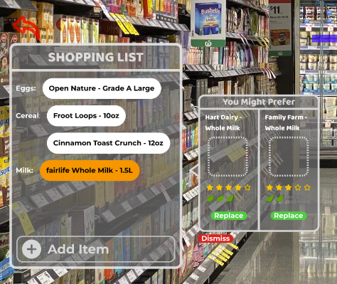
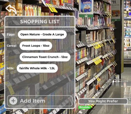
H1: System Visibility – Severity: 3 – 3 (🤟) people found this problem Problem A: Can't tell which items we are replacing in the you might like section Solution A: Highlight the item with the suggested replacements
Another heuristic violation occurred with our “you might prefer” menu, which provided more affordable or environmentally-friendly alternatives to products already in your shopping list. In our original prototype, the “you might prefer” options simply floated to the right of the shopping list, with no indication of what item was being replaced. We addressed this by highlighting the product in the shopping list in orange, indicating what the alternatives were being compared to, and would replace if accepted.
H3: User control and freedom – Severity: 4 – 5 (🖐) people found this problem Problem A: Lack of back buttons, exit, undo, etc., users cannot go back in a set of dialogue, nor can they exit a dialogue until it is complete, and more importantly users cannot change any answers they have. Problem B: No way to return to the exploration menu after clicking “add item” Problem C: No way to go back/exit to the user settings Solution: Add back and exit buttons
This problem was broadly present throughout our prototype. When designing our initial prototype, we did not consider that the user would want to navigate back or explore other pages before making a decision. In implementing our modifications, we decided to add close buttons, back buttons, and breadcrumbs throughout the interface. These have the benefit of always allowing the user an option to head back to a page they are more familiar with and understand better. The breadcrumbs also help in allowing the user to understand where they are located within the interface.
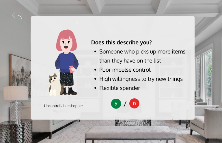
H2 - Match between system and real world – Severity 3.5 – 5 (🖐) people found this Problem: Personas are too general to be realistic/helpful, negative connotations with description and persona creates bias. Solution: We really like the research still. Maybe changing it to select certain traits of a persona to tailor the experience or changing it to questions that the user can answer?
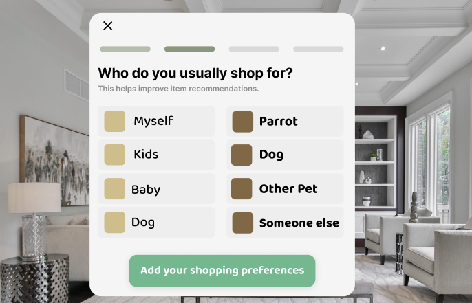
We removed the personas that had connotations associated with them. We agreed with the evaluation that having the user select from personas with certain connotations such as “poor impulse control” or “strict spender” would induce cognitive bias within the user’s selections. We do not want this bias because generally, we do not believe that it is an accurate representation of the user’s behaviors. Our solution to this problem was to replace the personas with items or categories of items that the user would purchase. We can then use the data from the user’s selections to inform their behavior patterns. Additionally, we added more focus on the pre-shopping experience, where the user would select their preferences from a selection of items to further inform us of their preferences.
Additional Easily-Addressable Heuristic Violations
After addressing the more critical usability violations in our prototype, our team addressed some smaller and easily-addressable aesthetic and navigation items in our heuristic evaluation.
One key issue that came up several times in our received feedback was the lack of transparency in where users are in certain shopping flows. We addressed this feedback by adding progress bars in two key places: the pre-shopping flow and the search flow. Now, the user is able to see how much of the pre-shopping configuration is completed and how much is left, and they are also able to navigate around the search flow using the breadcrumbs at the top of the screen without being trapped in a one-way flow.
Furthermore, our team refined the look of the onboarding and the pre-shopping screens to have more color as a first step in addressing the original gray color palette. Keeping with our theme of sustainability and our team name, the colors incorporated into the onboarding screens reflect the brown and green colors of the forest. Next steps will include introducing this color palette throughout the rest of the interface.
Finally, we reduced the opacity of the superimposed popups on the screen in response to feedback that it is not easy enough to see what is behind the AR interface. Since the user's will be navigating in busy stores, it is important that they are able to see what is going on around them.
Using the Refined Prototype
Our Figma prototype is still functional and can be used for further testing. The usability directions for the prototype are mostly unaffected by the changes that we made during this phase; although usability and functionality has increased, there are still discrete sections of the interface that need to be further interconnected and developed. See the Prototype Documentation for instructions on how to access and interface with the prototype, as well as context for the intended user group.
Current Design, Justification, and Next Steps
Our interface has the same core functionality and shopping phases as we initially planned in our Design Development, and our target personas remained the same as the ones developed in our Needs Analysis. We implemented onboarding and pre-shopping processes to both configure user’s preferences (eg, the extent to which they are concerned with shopping sustainably) and provide context for how to navigate our interface. We also included three key shopping interfaces that are tailored to different shopping styles.
Many of the features present in our current design are informed by feedback we received from user interviews during Design Development and Design Refinement. We expanded the number of product suggestions we gave users while they shopped and also gave them full access to detailed information about the products they were buying with collapsible data panels that are accessible by clicking on an item’s icon. While Little Trees AR does not have full functionality, there is at least one example of a flow highlighting each of the core features we developed and refined through the design process.
Given more time to further develop our interface, there are several key next steps we would like to take. First of all, we plan to fully address and correct the heuristic violations that we received during the final refinement phase. These include expanding the color palette from the onboarding screens throughout the interface, building out more complete connections between shopping experiences (focusing on increased user control), and working to reduce complexity (and lessen the learning curve) for new users. We also plan to implement our learnings from the Usability Study that we conducted and to continue user testing as we iterate.
During this phase, a key trade off we made was to conduct an extremely abridged version of the usability study that we planned in the interest of time. Because of our study’s limited sample size, we can not be certain that our findings are statistically significant. Our takeaways and insights from the study are documented on the Usability Study Results page, as well as the multiple other steps we would like to take in future/expanded testing. Additionally, we were only able to focus on a subsection of the heuristic violations to resolve. A challenge with implementing “undo” operations in Figma is keeping track of every possible screen flow in order to preserve past states; we chose to balance implementing comprehensive undo/back functionality with our desire to limit the number of screens to keep track of, by selectively choosing where to implement the back functionality as an example of what it would look like if it were fully implemented.
Phase Effort Distribution
| Task | Team Member(s) |
|---|---|
| Formal Usability Study Plans | All |
| Formal Usability Study Results | Alex, Lydia, Yehya, Zayn |
| Lightning Presentation | Alex, Lydia, Will, Yehya |
| Final Refinement - Heuristic Evaluation Response | Alex, Will, Yehya |
| Final Refinement - Current Design, Justification, Next Steps | Alex, Will |