List of Inspirational Designs (Compiled as a Group)
- Google Maps Eco – indicator for routes
- Google flights emission for quotes flight, and comparison to average
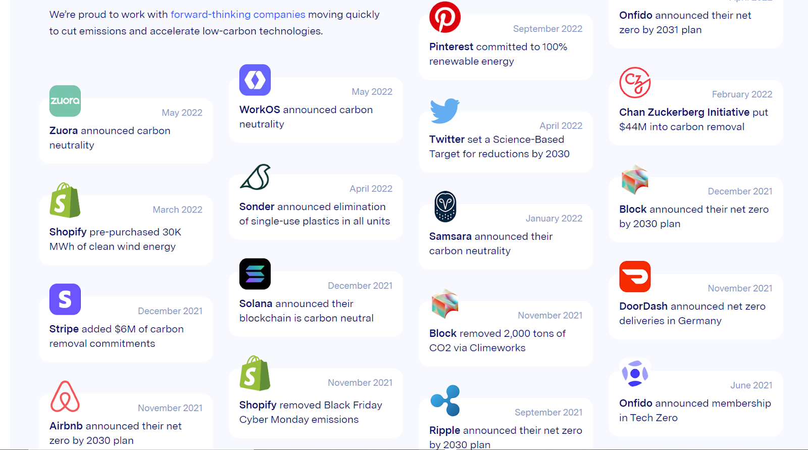
- Climate Neutral – startup giving consumers information on brands that emit low carbon/carbon equivalents & helping brands track their data
- Kizy End-to-End supply chain visibility tracking – One use-case of this tracker is for companies that want more visibility over their supply chain efficiency. Has an online dashboard to access sensor data from the tracker that they incorporate into their package - available also with an API.
- Apple has environment as part of its sales strategy
- AWS Carbon Footprint Tool – Amazon Web Services presents users with the emissions associated with their use of AWS to help them meet their carbon reduction goals. Their dashboard includes Scope 1 and Scope 2 emissions.
- Aklimate (UK) – startup that allows suppliers to log their carbon emissions & gives them recommendations on carbon reduction pathways
- CO2 Analytics – startup that’s doing accounting from businesses
- Watershed – This business helps companies reduce their carbon emissions and it provides data on different companies.
- EPA – Greenhouse gas reporting program for companies in different sectors
- Profitize – Dribble dashboard that shows analytics of a company.
- Salence – Dribble dashboard with analytics of a company.
- Versus - Electronics devices, food, and educational institutions, review aggregator and comparison tool
Most Liked Features
- Compare emissions to average / other flights
- Displays the units for one customer
- Theme-based illustrations/images
- Graphs and charts
- Graphics are separate and uncluttered, so it is easy to understand what is being displayed
Most Disliked Features
- Uses unit abbreviations that are hard to interpret for the average user (MTCO2e)
Exemplar Image
Individual Writeups
Yehya Albakri
Design selected: Google Flights
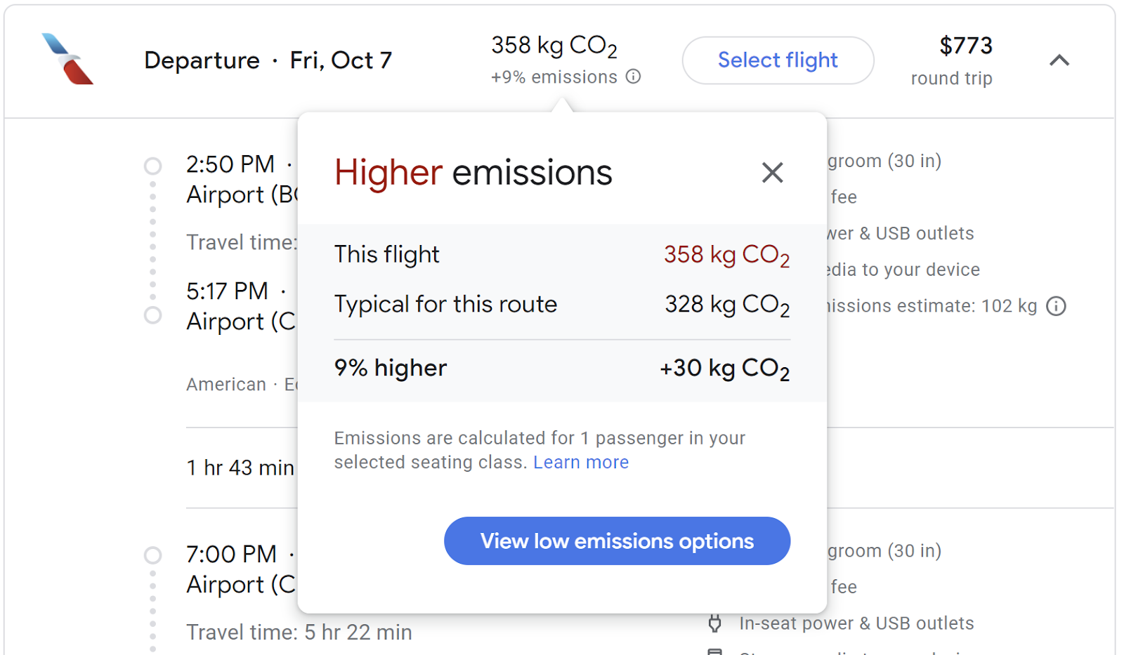
Google Flights offers an option where they inform you of how much Carbon your flight will produce. It will also compare it to the average carbon that your route will produce, and provide you with an option to view only low-emission flights. The nice thing about this is that it integrates environmental-awareness within the purchasing decision of a customer. They don’t need to go out of their way to find this information.
This is very similar to the product we intend to offer, but we are intending on creating a more universal solution that can be integrated throughout platforms through an API, in addition to being available as a standalone resource.
For example, if this product would be integrated as part of an investment platform, it would rate companies by their emissions / ESG awareness. It may even be possible to integrate it within an online commerce platform so that the user would be informed of emissions produced by the product they are looking at, and compare it to (or suggest) other products which may produce lower emissions.
Nice features:
- Simple number for emissions
- Compare emissions to average / other flights
- Click to learn more / see a more detailed view
- Click to view eco-friendly alternatives
- Displays the units for one passenger
Bad features:
- Simplistic offering; only shows CO2 production, no other metrics for pollutants / ESG
Zayn Patel
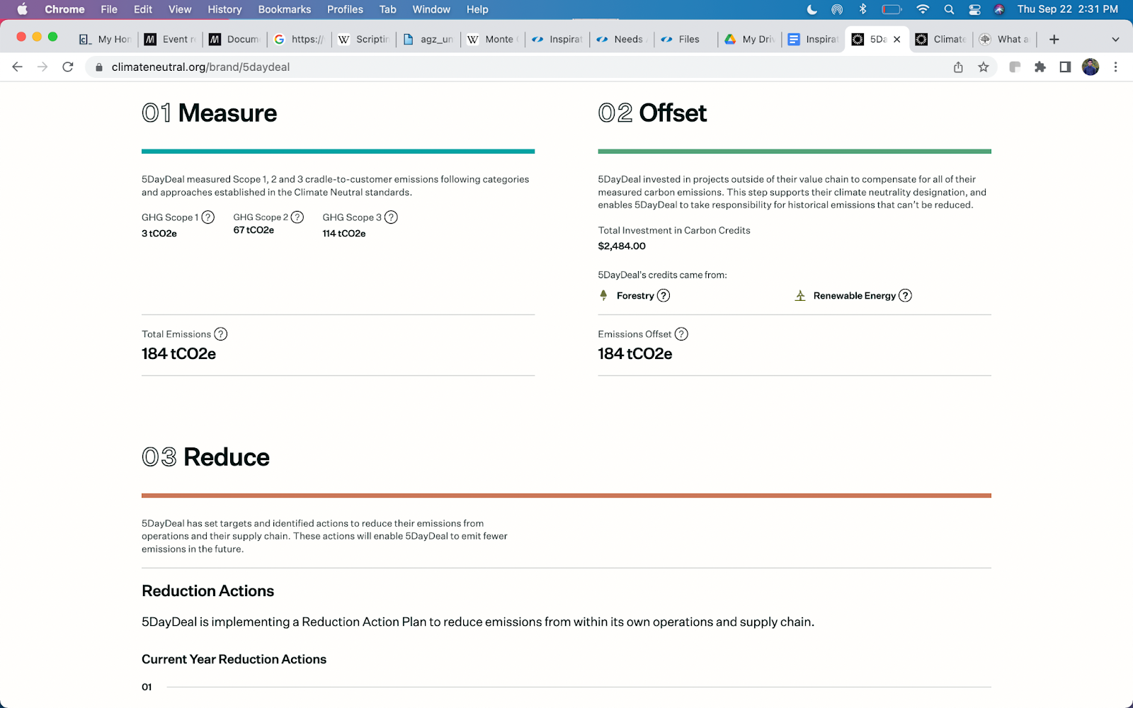
Design selected: Climate Neutral
// Good
// Bad
Our idea is to create a two-sided carbon accounting platform. Consumers use the platform to view companies' carbon emissions and companies use it to log their emissions. Climate Neutral is a competing company with an elegant design and color palette. On each company page, you can view the measured amount of carbon in the core emission sectors (scope 1, scope 2, scope 3). Climate Neutral doesn’t have graphs explaining what is contained within scope 1, scope 2, and scope 3 emissions. As a curious consumer, this is an interesting design tool to have. As a business, I’d like to see a visual distribution and machine learned recommended actions to take so I can reduce my emissions footprint.
Climate Neutral has an offset feature which shows the amount invested in Carbon Credits/Forestry. As the amount of climate research increases and policy changes, offsets are no longer as praised as they used to be. Carbon credits have had increased scrutiny, especially with questions on their validity. As opposed to showing how companies are offsetting, consumers could see news pieces/company reports about the shifts companies are making in their strategies as a result of their carbon data. For example, apparel companies choosing another supplier that emits less carbon.
Lastly, in the Reduction Actions they give vague graphics about the progress a company has made toward a goal. There isn’t a clear how either. Adding a live dashboard for how a company’s actions are affecting their progress towards a goal could bring more optimism from consumers and hold more businesses to the improvements they state.
Alex Matsoukas
Design selected: Amazon Web Services (AWS) Carbon Footprint Tool
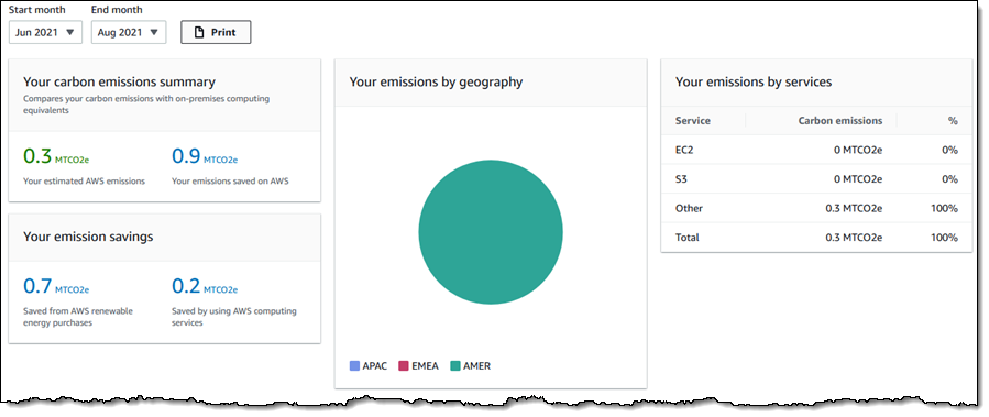
In March 2022, in an effort to work towards The Climate Pledge, AWS launched its Customer Carbon Footprint tool, which is a user-facing interface that allows users of AWS to see the cost associated with their use of AWS and incentivize them to meet carbon reduction goals.
The way this dashboard applies to our envisioned product is that it is a method of organizing and displaying data in a way that a person with no background in sustainability should be able to easily understand. For our project, we would like to have a display that indicates how eco-friendly a company/product is without making the user need to do extra research to understand the environmental consequences.
I think that the simplicity of this dashboard is something that we could emulate in our own product; it has graphics that aren’t too confusing or technical and there aren’t too many focal points that overwhelm the user.
However, I also think that there are a lot of problems with this dashboard that our team should aim to avoid when designing our interface. First of all, the eye is drawn to the center pie chart before anything else, but it doesn’t convey that much information. Knowing the emissions by geography doesn’t seem to be as helpful as knowing the scale and impact of those emissions. On that note, it doesn’t explain to the user what the unit MTCO2e means, and it doesn’t seem to indicate if the user’s numbers are good or bad. There seems to be some color-coding with the green and blue text, but it’s not clear what the colors represent.
What I Like
- Graphics are separate and uncluttered, so it is easy to understand what is being displayed
- Color coding is used to make distinctions; however, it should be clear what those colors signify in the context of this dashboard
What I Don’t Like
- Hard to find the data because it is hidden in the menu under “Cost and Usage Reports” instead of having its own page
- Uses unit abbreviations that are hard to interpret for the average user (MTCO2e)
- In order to understand what goes into these measurements or to get more details about what the numbers are measuring, the user has to go to a separate page that has paragraphs of text.
Lydia Sammy
Design selected: Watershed
Watershed is a company that helps companies to keep track/measure their carbon footprint, report their progress regarding how much they have cut their emissions, and give them an opportunity to fund/donate decarbonization initiatives. This is helpful to investors and consumers because if they happen to care about sustainability, they can simply just access Watershed’s data online to see the level of sustainability that various companies have adopted. Based on this, people will be at a better position to make better financial and investment decisions.
What Watershed is doing is almost similar to what our team is trying to do. This is because it puts together data in the form of numbers, visualization methods, and even articles for the general public to access. This data contains various companies' carbon emissions over the years for people who are interested to become investors to see and guage how their investment will help improve or degrade our ecosystem and planet.
Their various models such as carbon emissions measurement metrics and resources such as articles or reports written by other parties about a company’s carbon footprint could be integrated into what we are trying to build.
What I like:
- Visualization i.e. graphs and charts
- The user is given a bunch of options/varieties i.e whether to report, reduce, remove, or measure.
- Illustrations on the website
Will Li
Design selected: versus.com headphones comparison tool
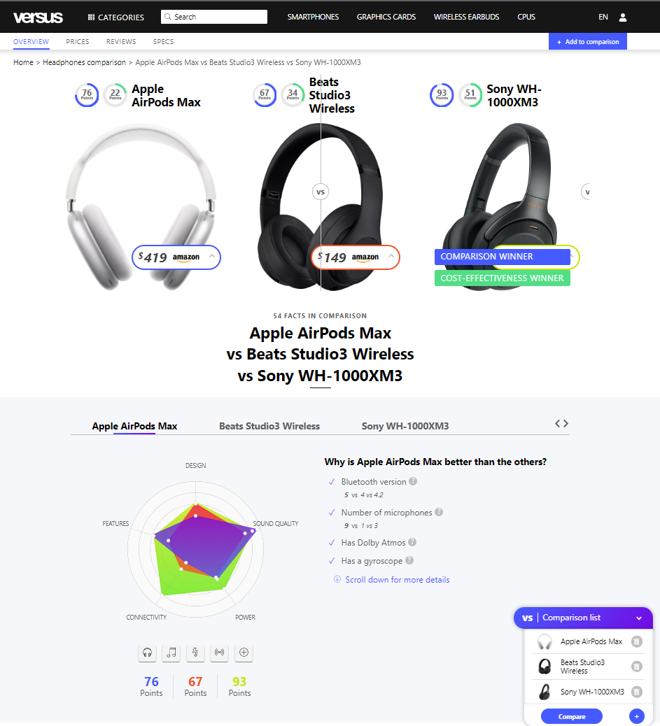
Versus.com is a platform that aggregates online and user-submitted reviews to help compare anything, with a primary focus on consumer electronic devices, food items, and educational institutions. Considering the overwhelming quantity of information available online, consumers struggle to quickly compare and contrast everything from the nutritional value of different fruits (eg, pomegranates vs passion fruit), to the prices of different wireless earbuds.
For consumers, the imbalance in information (too much information on one product, not enough on the other) can make confident, informed purchase decisions very difficult. Versus.com aims to address these problems by consolidating information from reputable sources, and providing consumers with accurate, easy to read, side-by-side comparisons. If a consumer wants more info, they can scroll down and see where the point values were awarded, and on what basis.
In this image, we see a versus.com dashboard comparing three competing headphones from three different manufacturers. While Beats’s website might provide comparisons between their own Beats products, it is much harder to find objective metrics comparing the Studio3 headphones, with the Airpods Max and the XM3, all in one page. Unlike other review websites, versus.com has assigned standardized point values to certain, allowing a user to swap out products in the table. This user-informed comparison gives individual consumers agency over how they use the dashboard. Instead of being silo-ed into a single categorization (eg, comparing Airpods Max with a fixed set of other high end over-ear headphones) a user can easily compare the Airpods Max with Airpods, or any of the other seemingly infinite number of headphones in the database.
I quite like the versus.com model because it not only aggregates standardized information, but makes it incredibly easy to shop around. It also includes many data points, such as sound quality, or battery life, which allows consumers to compare the features that matter to them. I think we can model our product in a similar way, collecting and aggregating ESG (environmental, social, governance), data on several different companies.
How does this connect to our product?
I think our platform should have a similar mix-and-max comparison function, as consumers might compare different companies depending on their needs. For example, someone buying a new phone might want to compare Apple with Samsung. A second person buying a laptop might want to compare Apple with Lenovo and HP. A third person looking for a tech investment might want to compare Apple with Facebook and Netflix.
If we aggregate a multitude of data points and metrics, consumers can use our product to compare these companies based on their carbon footprint, % of POC in leadership, corporate equality scores, or any other metrics that they might care about. Ultimately, consumers can make comparisons very easily, and can avoid having to dig through old databases and clunky .pdf ESG reports.
One particular feature I really like in versus.com is the visual radar chart. While versus.com uses it to help compare sound quality, or price, our platform can feature a stacked radar chart that helps consumer’s quickly see which company has the best ESG score, or which company has the best carbon footprint.
One feature I don’t like about versus.com though, is how the metrics are someone “stuck in time”. While Airpods are always going to be Airpods (and their specifications won’t randomly change), companies are dynamic, and their scores are going to change over time. I think we could create some sort of “scores over time” graph, that can show users their selected company’s historical carbon performance and how it has changed.
Positive Features:
- Radar chart
- Easy mix and match feature, allows more combinations of comparisons
- Standardized point values and comparison data points
- Visual, side by side comparison
Negative Features:
- Not dynamic (doesn’t change over time, or show the change over time)
Neutral Features:
- Assigning our own point values might be arbitrary and subjective
- Unless we use industry-standard, objective metrics, we might appear trustworthy
- We have to put a LOT of careful thought into where we research and source the data