What Is Animap
AniMap is a database of animators, events related to animation, and resources for animators. All of the data stored on AniMap is tied to a location. When searching for anything on the website, it displays the information on a map. The purpose of this is to help connect local animators to each other and foster in-person relationships.
The site opens to a search bar which the user can type their request into with a few commonly searching tags below it. Most of the site revolves around this search feature and its corresponding map. Our concept is to allow users to search for profiles or events that may be related to their interests and then giving them a map of where these people/events are in relation to them. The goal of our design is to create a simple interface to find this kind of information but not necessarily be a social media platform where people can contact one another online. AniMap's emphasis on creating in-person relationships is why there's only a search method but not a built-in feature to chat with another user.
Check out our current prototype here:
The Evolution of Our Prototype
Our Initial Paper Prototype
For our user group specifically, that being animators and other similar creatives, aesthetics cohesion is of utmost importance. We wanted our website to feel familiar, casual, and a little DIY. This is reflected in our paper prototype which is shown below.
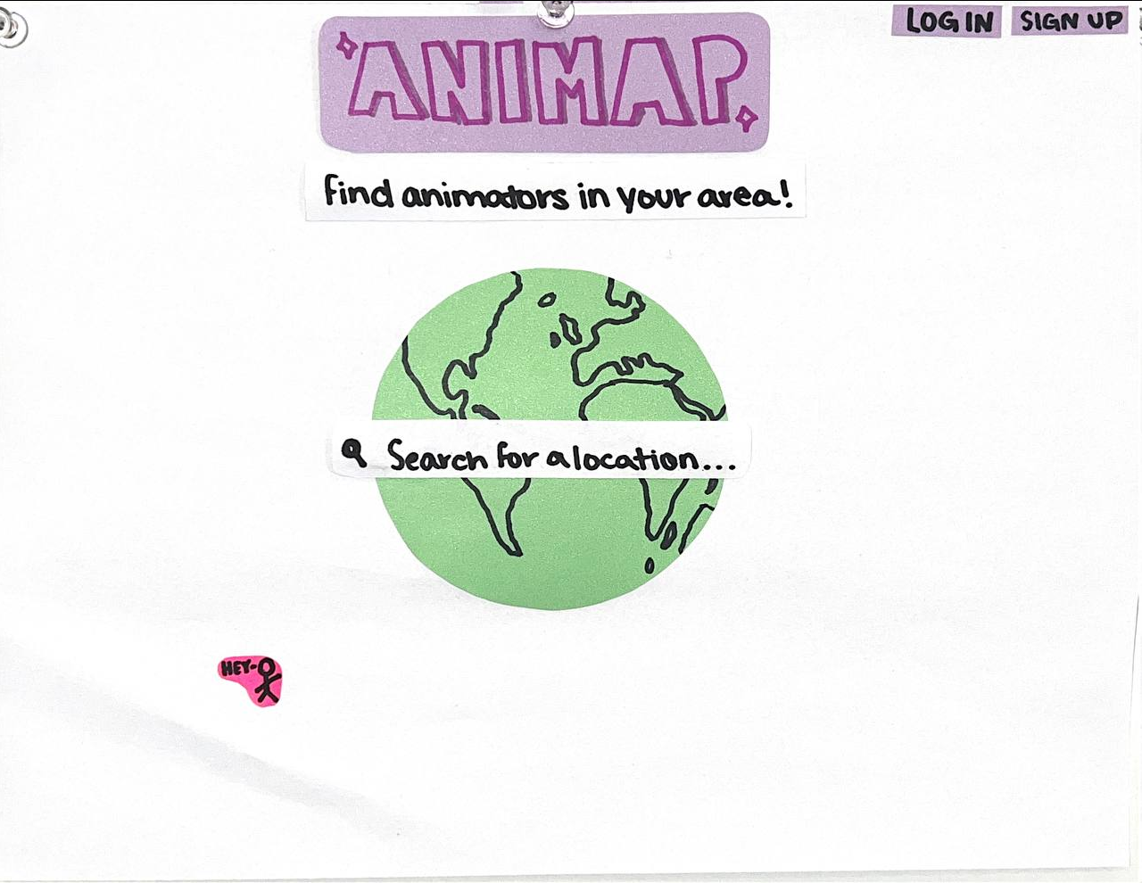
Figure: Our initial paper prototype.
Our paper prototype established some important design ideas that we wanted to maintain in our Figma prototype. One of those ideas was placing the earth in the center of the homepage with a search bar on-top. This is supposed to signify that a user can “search the world” for other users while emphasizing that animators are everywhere and even though an animator might feel isolated, they aren't alone. Another idea was that we wanted our idea to feel joyful and playful. One design element where this idea manifests itself is our font.
Overall it was a nice way to start this design, but there were a lot of things missing. Most importantly, the design felt bare and there was still a lot of missing functionality
Figma Prototype #1
Our first Figma prototype was supposed to be a proof-of-conecept of our paper prototype as a Figma prototype. We now had a few more buttons for the extra functionality we had thought of at this point, but there was a lot wrong with this version. This design seems like a website from the 90's about the future, which is far off from the aesthetic sensibilities of our user group and the aesthetic designs established in our paper prototype. The star-trek-esque font, the neon green text color, and the dark background, made our design feel sterile and boring. We decided to hit the drawing board again and make a new Figma prototype. This time we wanted to focus on revamping the visual design of the website while maintaining the functionality added in our first Figma prototype.
Figma Prototype #2
This version harkens back to the original paper prototype, though it also has quite a lot of user walkthrough feedback incorporated in it. It is a full redesign that trades the clean and sterile design of the previous version for a noisy, cluttered, and energetic aesthetic. We include Animan, an idea from the original drawing that is supposed to be like a DIY clippy a user can edit. There is a bit of a torn paper aesthetic, which draws from the literal paper prototype and is supposed to look like an animator's scattered scratch paper. We also decided on a more firm tetradic color scheme that was color blind friendly, based mostly in pastels, though for this version, the scheme seemed to get lost towards the edges of the document. This was the prototype we submitted to the heuristic evaluation which means we got a lot of feedback on the design. All the feedback, discussed later in the report, lead us to our final prototype.
Figure: Playful version of our digital prototype.
Based on the feedback that we had received, we decided to try to find an aesthetic middle ground between the loud and poppy previous design and the more tame and sterile first design. We address the color cohesion issues by restricting our color palette to something more near analogous green-blue rather than the more complex tetradic scheme we had tried to use all over before. To make the analogous colors pop more, there are more high and low contrast regions on the document, having the background be a more neutral blue so that the world pops out, and using negative and positive space to separate and emphasize the title text. We also changed the font, especially radically changing the non-header font so that it would read more professionally. Overall this design trades in the loud, obnoxious, and off-the-wall design of the last prototype for a creative, harmonious, yet still energetic design.
What did we learn?
Feedback from cognitive walkthroughs & heuristic evaluations
We got a lot of feedback through our codesigns to place importance on creating a site that felt familiar to animators, something that contained exciting colors and animations. We chose to take inspiration from some of the sites our users had enjoyed as children. As a result, we tried to make our visual design feel whimsical and fun. However, in our heuristic evaluations, we realized that we may have gone too far to one side of the spectrum where the site was almost too childish. Specifically, it made people looking at our site feel like they weren't being taken seriously and that they were on a site intended for kids. This taught us a valuable lesson in figuring out what's the right balance of more interesting design choices that we think our user group might like and traditional site design to provide some familiarity for people.
In both our heuristic evaluation and cognitive walk through feedback, we were told that exploring the search results was a difficult task. There were a lot of icons all over the screen and it wasn't easy to figure out what they meant. That meant that it was difficult to figure out what you were supposed to click on as a user. The reason for this confusion was clear. Our team had story boarded out many possibilities for how search results could be displayed to the user and rather than picking just one from our prototype we used elements from all of them. Rather than improving our design, this actually made our design harder to use. Our solution to this was to follow Jakob's Law which suggests that users will spend a majority of their time on other websites which means that they'd prefer your website to work in the same way. We ended up modeling the search results page more closely on the search results page of Google Maps. This meant displaying pins on a map that correspond to search results that are listed in a separate section.
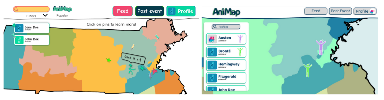
Figure: Left, the initial digital prototype for the search results page. Right, the modified search results page that attempts to follow Jakob's Law.
If you're interested in reading more of the feedback we got from our heuristic feedback, check out the documentation here:
Improving Teaming Skills
To be honest, one of the key insights we got out of this phase was not at all about our prototype or design but rather around the teaming aspects of our project. We went through a few different of team management and spent much of this time figuring out what works best for that. We learned that it's important to resolve teaming issues directly so that we're able to move forward and work together more efficiently.
Another insight we got through this phase was how to navigate having multiple design directions on one team. We initially tried to have people work on different parts of the same prototype but quickly realized that when we did that there wasn't cohesiveness between the two designs, especially after our heuristic evaluation. This brought us to the question of whether it is better for all of us to work on one prototype or increase our workload and work on two different prototypes with different visions. We realized that despite feeling like it would slow us down, the quality of our work would be better if we had two prototypes with cohesive designs instead of one prototype that was an amalgamation of styles. Once we had two complete prototypes we took the time to decide what we liked from each to create our final prototype.
After our heuristic review, we also learnt a lot about how to parse through feedback. For example, a piece of feedback we got was that including the Date of Birth as a signup field felt odd to them as most sites nowadays require that you only give your name and email. While our initial reaction was to take the feedback and immediately change things, the more we thought about it the more we felt like that field was valuable and we didn't communicate that very well to our reviews. The reason the field existed in the first place is because the primary purpose of our site is to encourage people to meet up in person with others. Encouraging minors to meet up with adults could potentially be a really big problem which is why we wanted some age restrictions. It was incredibly important for us to be able to think through the different feedback and be able to justify why we didn't agree with some of it.
What's next?
Going forward, we have a few different things that we still need to answer. In our current prototype, we've only implemented the profile search so the primary question we need to ask ourselves is how are we going to differentiate between profiles, events, and resources in a way that's easy for our users to understand but also doesn't lead to an overly cluttered page. We also want to do more investigation into coloring and see if there's a way we can keep the fun and colorful vibe of the site while making it more cohesive and less busy with all the different colors. Although this isn't a graphic design class, through our interviews with different animators, we've found that this is an aspect of user experience that they greatly value which means that we also want to understand and make our site a pleasant experience for them to utilize.