Final Refinement
Piloting a formal usability study, incorporating feedback, and producing a final iteration.
Final Design
Overview
Over this project, our team created an app to encourage users' relationship with the environment through plant identification and documentation. The app encourages use through gamification, working to toe the line between using an app to encourage user relationships and interaction with the environment and not impeding such interaction with a digital space. Our app includes a plant identification page offering options for both photo and name identification., a garden page to add the plants you find, detail pages for the plants, and quizzes on each plant to learn more about them and win water to take care of them as well as a settings page where you can change your settings.
Shortcomings
While we successfully implemented many of the main pages and their associated functionalities, there are aspects that remain unfinished which we did not get to address due to various factors such as figma experience and time constraints. One notable missing functionality is the ability to move plants around within the garden view. We designed an overlay that appears once you select a plant, which offers options to view details about the plant, move the plant, or delete the plant from your garden. If a user chooses to move a plant, they should be able to drag it across the garden to place it where they believe it would look best. Alternatively, if the user selects "delete" it would remove the plant from the garden.
Also, due to our limited experience with Figma and time constraints, we were unable to implement a feature that would allow users to drag the garden view to explore beyond the view we presented in our Figma prototype. We imagined a user being able to view farther left and right. This would provide more space for arranging and viewing collected plants.
Regarding the profile page, although it includes a space for the top 5 plants, we didn't have the opportunity to incorporate the interface used for selecting these plants. Furthermore, our settings buttons, log-off button, and delete account button have not been fully implemented yet.
Overall given more time, we would continue to polish our design and refine our visual aesthetics while implementing additional functionality.
Justification
From This Phase
Heuristic Evaluation Revisions
Based on the feedback that we received during the Design Refinement phase, particularly from the Heuristic Evaluation review, we modified our design significantly. All small changes that were easy to implement (adjusting locations of artifacts for symmetry, spelling mistakes, etc.) we implemented. The most egregious issues (those rated at least a 3 on the Heuristic Issue Evaluation scale) were all resolved or challenged by our team during this phase.
| Heuristic Number and Rating | Heuristic Issue Description | Resolution |
|---|---|---|
| [H4 Consistency and Standards] (Severity 4) | I’m unsure if it is a flow issue, but I can click the flower three times and end up at three different screens, the garden image, the screen with the camera option, and the logbook. This is confusing. Users would need more understanding of what is happening on each screen, adding more text or page titles would help with that. Pressing the middle flower button while on the home page takes you to the Log Book. However, if you press the same flower button on any other page where it appears, it takes you to the garden scene page. Users need to trust that the buttons they press take them to where they think they go. | This was a figma flow issue, we reviewed all of our connections on our prototype and corrected any erroneous connections. This was an important issue to fix with a straightforward resolution. |
| [H10 Help and Documentation] (Severity 3) | Users new to the app will have confusion about what the garden screen is meant to be or what they are supposed to do there. | We agreed that the garden page was confusing on what functionality was available on the page. We addressed this by making clearer buttons and adding additional functionality in the form of water droplet gamification. And adding clearer signaling on other buttons present on the page. |
| [H1 Visibility of System Status] (Severity 3) | Users should have some kind of indicator of what page they are currently on in the navigation row of buttons. For example, a user starting in this flow would have no idea that they are on the search page and might think pressing the search icon button in the lower left will take them somewhere different. | We addressed this issue by highlighting the background of the button to signify the page you are actively on. This was a helpful change as it provides feedback to the user to assure them which page they are on correlating to the button they pressed. |
| [H8 Aesthetic and Minimalist Design] (Severity 3) | The scientific name, as well as the other words in the White Oak details page, in that font at that size is too small and difficult to read, especially given that they are words most users won’t be familiar with. | We addressed this by increasing the font size on pages where the issue was noted. We also expanded the issue to look for other pages where it could be an issue and kept it in mind as we added new pages. This improves overall user usability. |
| [H4 Consistency and standards] (Severity 3) | The left button in the navigation bar has a search icon, but doesn’t actually take you to the specific “search” page. In particular, this is the same icon as the one in the search bar, so users would expect the button to take them to the same screen as the search bar does. Using the magnifying glass for both is confusing. Having a different icon there for the “Add a Plant” page would clarify the distinction. | While our team did note and review this ultimately after discussion we opted to not change this point, going along the line of thought that this might be a point that users would recognize after using the app once or twice. However, we do note that this could be confusing and include a learning curve, as we are using a common mapping of the magnifying glass symbol in the search bar but also using it in a slightly different way to access the plant search page. |
| [H8 Aesthetic and minimalist design] (Severity 3) | In the search-by-text page, the text is quite small and would definitely be unreadable on a phone screen. Same comments as #6 above. | To address this comment, which was rooted in aesthetic decisions, we increased the font size on the search by test page. |
| [H3 User Control and Freedom] (Severity 3) | There is currently no way to delete entries from the Log Book. Users might want to get rid of an entry if they don’t need it or add it by accident. | While we note and agree with this comment, we were not able to implement this function in Figma, as this was outside the scope of our project. |
| [H3 User Control and Freedom] (Severity 3) | Going back to the garden-looking page, there is no ability to edit the page. From what I assume, the page is essentially a scene in which you can show off all of the plant entries in your log book. Some users might want to edit the scene to fit their style and preferences. | We chose to partially address this issue and add more elements that could be interacted with to show more of how we intended the page to be used. For example, while we did not implement a panning feature (allowing users to move to other sections of the garden), we did add more elements that facilitate interaction with the plants. Now, if users click on the plants, they have the option to move the plant or to go to their details pages! Also, every 24 hours, a plant gains the option to be watered, which a user can do by clicking the water symbol above it and answering some questions about the plant. |
Additional Modifications
Profile Page:
We completed a profile page accessible via the third and final button. While this profile page provides a glimpse of the basic functionalities expected in the final product, it's important to note that some features are not fully implemented. Within the profile page, the "Top Five Plants" section allows users to select and showcase their favorite plants on their profiles, while also displaying key information like total plant collection and membership duration. Additionally, the profile page includes standard features like a username display, a settings page link, a log-off option, and an account deletion button.
Gamification - Water Droplet:
During our initial brainstorming and ideation phase, we considered incorporating gamification elements as a means to continually engage our users. In our final implementation, we integrated a quiz-like feature for plant care. When a plant requires watering, it displays a water droplet icon, and neglecting it for too long leads to the plant becoming less vibrant over time. Clicking the water droplet presents the users with a multiple-choice question about the specific plant. Importantly, this system is not meant to be punitive, users can continue to attempt the question as many times as necessary to answer correctly. This interactive and incentivized approach encourages users to learn more about the plants in their garden leading to continuous learning for users.
Accessibility - Color Palette:
In an effort to ensure the accessibility of our application, we subjected our page to a color palette visualization tool designed for color blindness. As a result, we made adjustments to certain colors to enhance contrast and prevent potential issues.
Formal Usability Study
Intro:
After implementing these changes, we came up with a few more hypothetical ones that we were unsure of. We decided to drill down into these and test user reactions to different options. The best way we could come up with to test these was through A/B testing of each hypothetical change. Our hypotheses are as follows:
- Changing the garden icon by replacing the flower icon with a shovel icon can is expected to enhance the garden page's recognizability, making it easier for our users to navigate to the garden page.
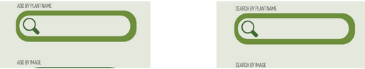
- Changing the button labels on the home page from 'Add by Image' and 'Add by plant name' to 'Search by Image' and 'Search by plant name' is anticipated to expedite and enhance the user workflow for plant identification.

Benchmarking:
Our dependent variables included time and user sentiment. Time was a valuable metric as we aimed to minimize the duration it takes for a user to access the garden page or identify a plant. User sentiment was quick to measure as we could survey multiple users about which options they preferred.
If our first hypothesis was correct we would see a decrease in time that it takes a user to find the garden page, and a decrease in visible or apparent confusion about the function of the app/the gamification of that page.
If our second hypothesis was correct we expected to see a decrease in time and actions it takes to identify a plant, as well as a more confident user base when it comes to selecting an identification method.
Methods:
We conducted tests with eleven subjects to measure time differences. Two subjects received the old garden icon, while the other two received the new garden icon.
Similarly, two subjects were presented with the original wording for plant identification, and another two were exposed to the changed wording.
All participants were asked to complete a task relevant to the test they are being given (icon testers: navigate to garden/text testers: add a plant).
In addition to timing their navigation of the app, we noted how each participant responded to the icons and wording, what their process looked like, and if they said anything about being lost or confused. After their process was observed, we showed them the other options (A/B icons/text) and asked how they would feel about a change (making sure to note which option they saw first, to account for bias based on order of information!)
The icons and wording will be the only things that change between the tested designs.
Results:
| Tested Component | Average Time to Use + Understand | Favored by # of Participants |
|---|---|---|
| Shovel | 3.4 seconds | 1/5 |
| Flower | 4.1 seconds | 3/5 1 person said neither |
| “Add by” | 16.9 seconds | 4/5 |
| “Search by” | 31.2 seconds | 2/5 1 person said both |
Rest of the Semester Overview
Throughout the semester, our design underwent numerous iterations. There are 5 key design insights we would like to emphasize: The decision to remove the community board, the choice to eliminate the map feature, significance of aesthetic design decisions, the valuable role of A/B testing, and the integration of gamification.
Check out our design insights here!
Effort Chart
| Assignment | Team Members |
|---|---|
| Formal Usability Writing | Declan, Raul, Meredith, Meagan |
| Formal Usability Testing | Raul, Meredith, Declan |
| Figma Revisions from Feedback | Norah, Meagan, Raul, Declan |
| Figma Gamification/Design | Norah, Meagan |
| Final Lightning Presentation | Declan, Meagan, Norah |
| Meagan's Midnight Madness | Meagan |
| Final Refinement Draft | Raul, Meredith, Meagan, Norah, Declan |
| Website | Meredith |